Embeddings, 384 Dimensions, Three at a Time
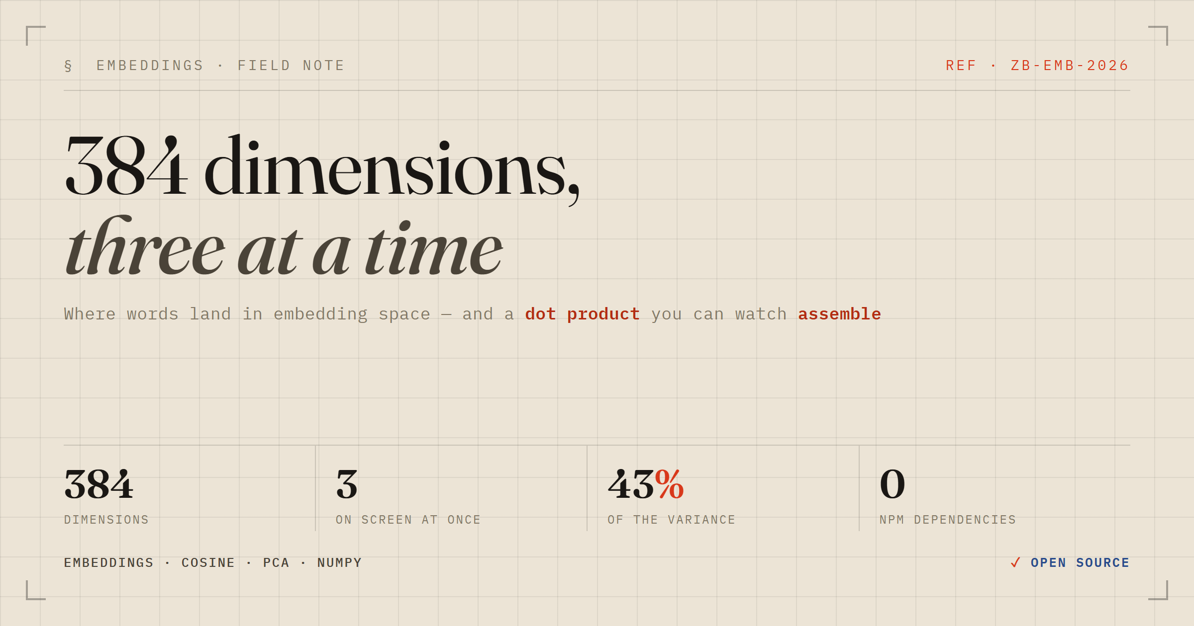
I have written the cosine-similarity snippet more times than I can count. Two vectors in, one number out, and that number is supposed to mean something about meaning. What I had never done is look at it — at where the vectors actually sit, at what the number is made of, at how much of the space I am even seeing when I plot it.
So I built an instrument. It runs entirely on my machine, it has no npm dependencies, and it exists to answer one question honestly: when you draw an embedding, what are you actually looking at?
The code is at github.com/zakariahere/visual-cosine. What follows is what it taught me, most of which I had wrong.
Every picture of an embedding is a projection, and the caption should say so
The model here is BAAI/bge-small-en-v1.5, served through fastembed. It emits 384 numbers per input, whether you hand it one word or a paragraph. A screen has two dimensions; give it perspective and you can fake three. So any scatter plot of embeddings is throwing away at least 381 of them.
Almost every embedding visualisation I have seen glosses over this. Mine states it in the caption, permanently, under the plot:
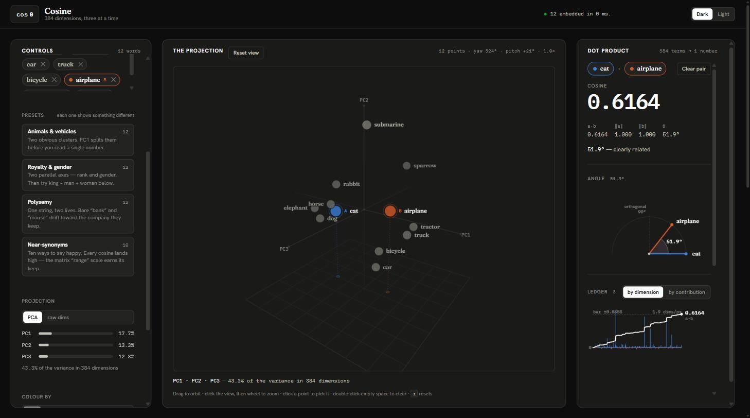
PC1 · PC2 · PC3 — 43.3% of the variance in 384 dimensions
That figure is computed, not decorative. For twelve words split between animals and vehicles, the best three principal components carry 43.3% of the variance — which means more than half of what distinguishes those words is not on the screen. Two points that look far apart may be neighbours along an axis you cannot see. Once the number is in front of you, you stop over-reading the picture.
The setup: local, offline, and boringly fast
fastembed runs the model through ONNX Runtime, so there is no PyTorch in the dependency tree. On my machine the model loads in 0.74 s and embeds five phrases in 6 ms. That speed matters more than it sounds: it makes the thing feel like an instrument rather than a batch job.
from fastembed import TextEmbedding
import numpy as np

m = TextEmbedding()                     # BAAI/bge-small-en-v1.5, 384 dims
V = np.array(list(m.embed(["cat", "dog", "kitten",
                           "helicopter", "the price of copper"])))

print(np.linalg.norm(V, axis=1))        # [1. 1. 1. 1. 1.]
print(V @ V.T)                          # this IS cosine, because the norms are 1
That second comment is worth pausing on. bge L2-normalises its output, so every vector has length exactly 1, and a · b = ||a|| ||b|| cos θ collapses to a · b = cos θ. Dot product and cosine similarity are the same number here. Convenient — and a good way to ship a bug that never surfaces in testing, because a function returning the raw dot product when it promised cosine looks perfect until someone feeds it an unnormalised vector.
Finding 1: nothing is orthogonal
Here is the similarity matrix for those five phrases:
                      cat     dog  kitten   heli.  copper
             cat    1.000   0.734   0.876   0.583   0.521
             dog    0.734   1.000   0.687   0.595   0.465
          kitten    0.876   0.687   1.000   0.572   0.472
      helicopter    0.583   0.595   0.572   1.000   0.403
 price of copper    0.521   0.465   0.472   0.403   1.000
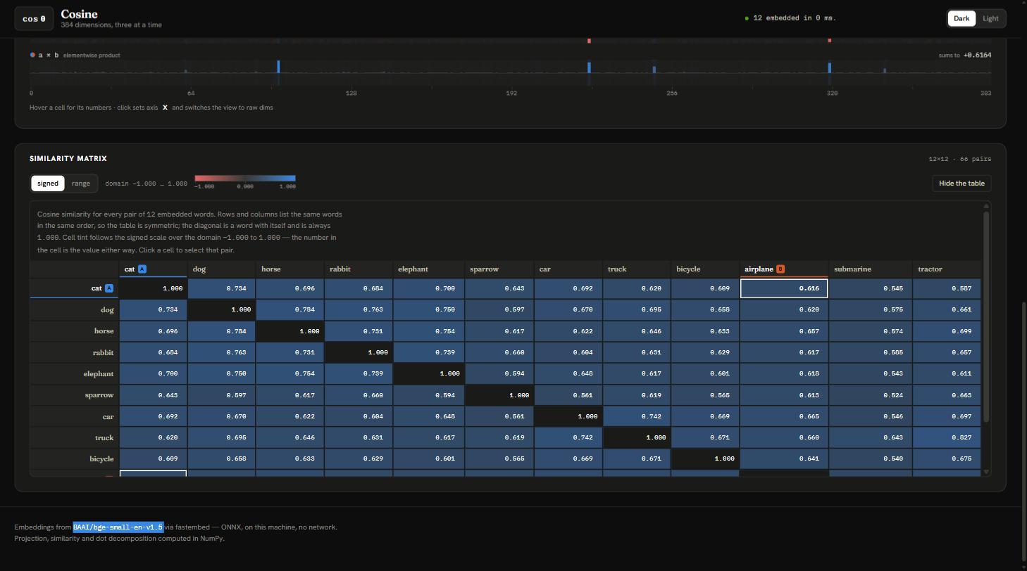
The ordering is exactly right: cat is closer to kitten than to dog, and closer to dog than to helicopter. But look at the floor. The least similar pair scores 0.403, and “cat” versus “the price of copper” — two strings with nothing whatsoever in common — sits at 0.521.
My intuition said unrelated things should land near zero. In 384 dimensions that intuition is not merely wrong, it is spectacularly wrong. I simulated it: random unit vectors in 384 dimensions have a cosine standard deviation of 1/√384 ≈ 0.051. Across sixteen million random pairs, not one exceeded 0.270.
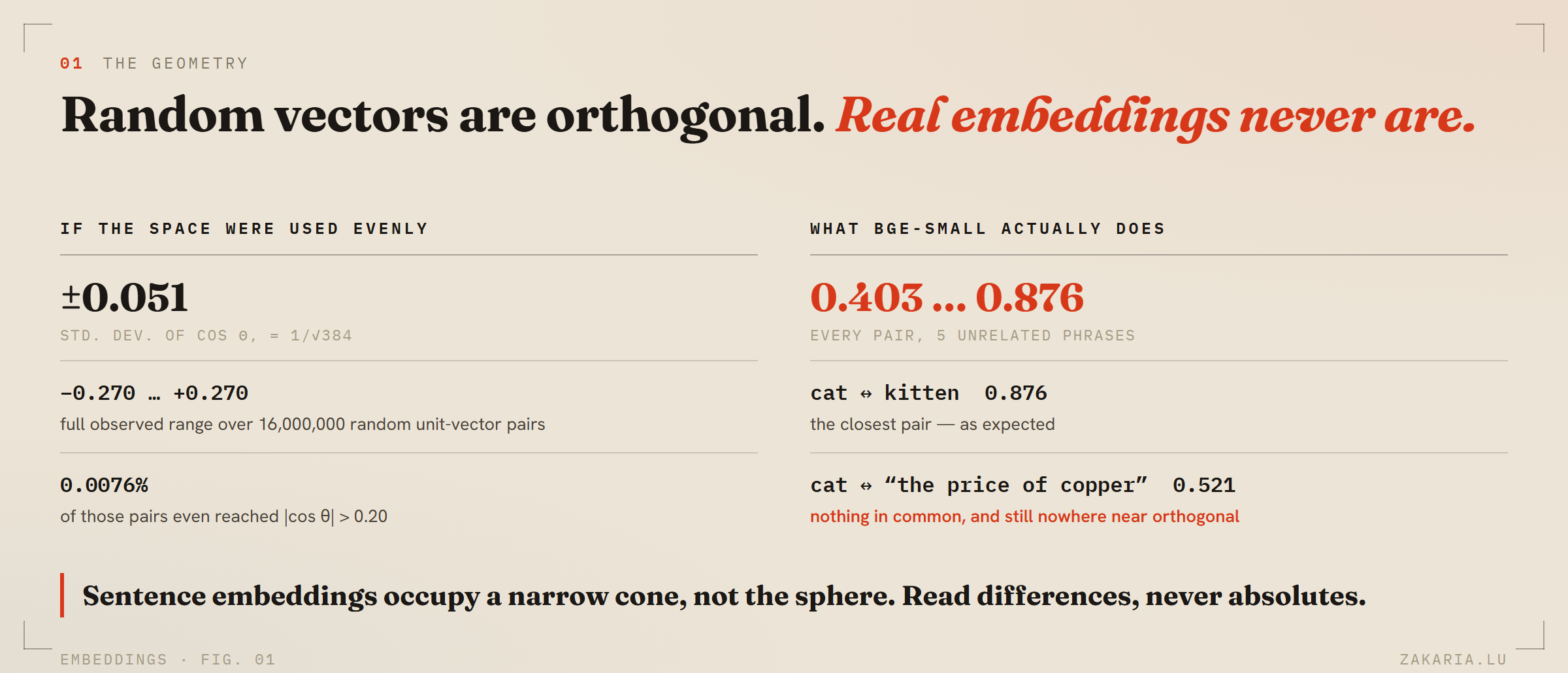
So a trained sentence encoder does not spread meaning over the sphere. It crowds everything into a narrow, entirely positive cone. The practical consequence is blunt: an absolute cosine tells you almost nothing. A score of 0.52 is not “vaguely related”, it is this model's version of “unrelated”. Only differences carry information — which is why a RAG relevance threshold has to be tuned per model rather than copied from someone else's blog post.
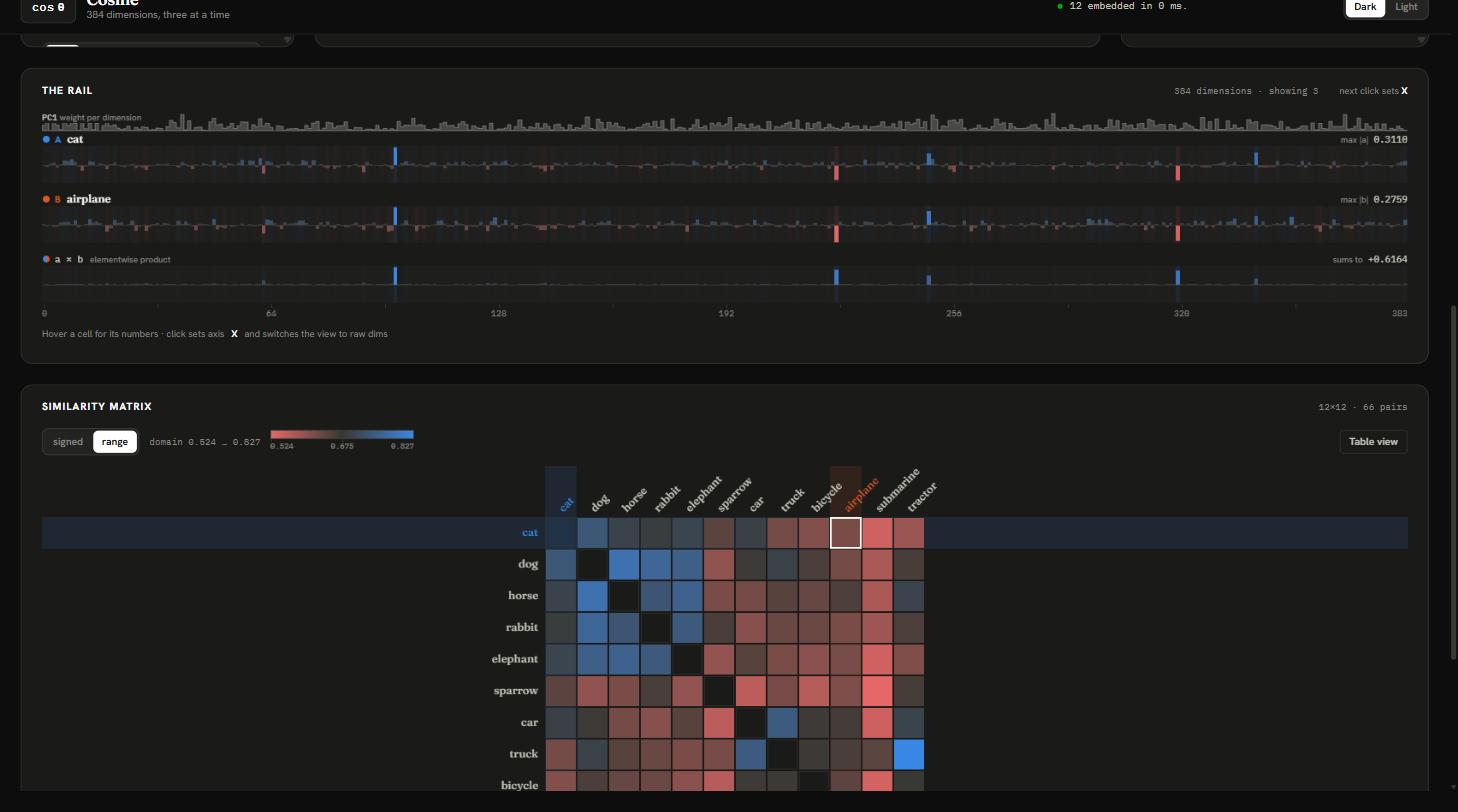
This is a visualisation problem too. Cosine has a real zero — orthogonality — so the honest heatmap runs a diverging colour scale over the full [-1, 1]. Do that and the matrix is a flat blue rectangle, because the data occupies a sliver of the domain. So the app ships both: the honest scale that looks flat, and a stretched one over [min, max] that reveals the two blocks. Neither is wrong. Knowing why they differ is the whole point.
Finding 2: the dot product is a sum you can watch arrive
A cosine is 384 multiplications collapsed into one number, and collapsing is exactly where the intuition goes. So the app draws all 384 products as bars and runs a cumulative sum across them, landing precisely on the cosine.
Left in dimension order it is a noisy diagonal climb. Re-sort the bars by contribution and the line becomes a steep curve that flattens early: a few dozen dimensions do most of the work and the remaining three hundred barely move it. The panel states it in words — half of everything added comes from 34 of 384 dimensions.
That is the sparsity everyone asserts about embeddings, made visible per pair instead of claimed in general.
Finding 3: no individual dimension means anything
The projection has a second mode. Instead of principal components, pick three literal dimensions — 12, 57, 300 — and plot those.
The cloud collapses into noise. Pick another triple: still noise. That failure is the most instructive thing in the tool. Meaning is not stored in coordinates; it is distributed across the whole vector, and each dimension participates in thousands of unrelated concepts. It is also the clearest argument for why PCA is in the pipeline at all — you are not selecting good axes out of 384, you are constructing them.
Finding 4: king − man + woman does not give you queen
The famous analogy. I wired up vector arithmetic expecting the textbook result. What comes back, ranked against a twelve-word royalty lexicon:
king    0.773
queen   0.713
woman   0.689
king wins. Subtracting man does not remove enough of king for queen to overtake it. The gender direction is real — queen jumps from nowhere to second place, and in the projection the twelve words separate cleanly into male and female along PC2 — but the tidy arithmetic that made word2vec famous does not survive the move to sentence embeddings. These vectors encode whole-utterance meaning, not composable attributes.
Most write-ups quietly exclude the input terms from the results to make this trick land. I left the ranking as it is. An instrument that flatters you is not an instrument.
Seven agents wrote it, and every real bug was at a seam
I built this with Claude Code as a deliberate experiment in parallel agents. I wrote the contract by hand first — a SPEC.md pinning every HTTP payload, the state shape, the event names and a file-ownership table — then ran a workflow: seven agents implementing disjoint files simultaneously, followed by three adversarial reviewers with different lenses (contract drift, mathematical correctness, visualisation and accessibility).
Ten agents, no failures, 8,422 lines, seventeen findings. The interesting part is where the findings were.
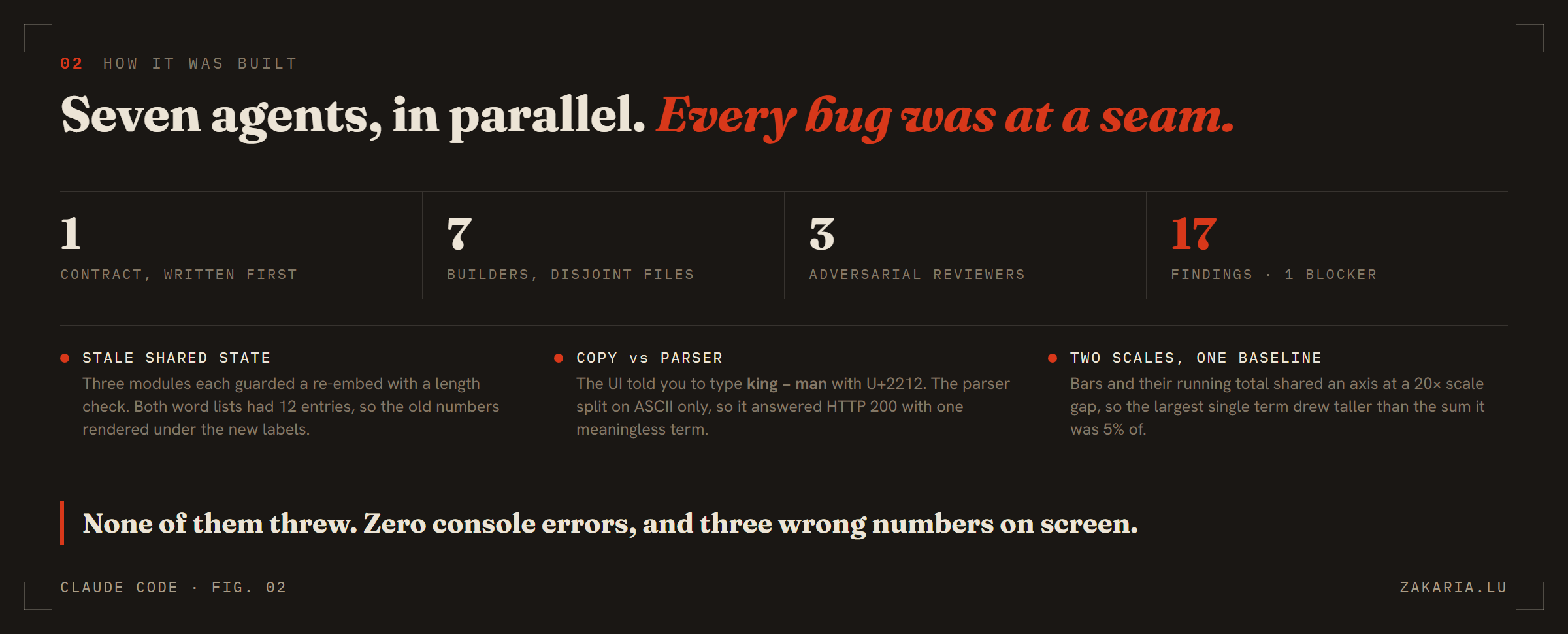
The blocker was mine, in the shared state store. Re-embedding set the new word list and announced it before the recomputed similarity matrix had arrived, so for two round trips the derived data still described the previous lexicon. Three modules independently defended against this with a length check — which passes when both word lists have twelve entries, and three of my four presets have exactly twelve. The old numbers rendered under the new labels.
What makes that one nasty is that the wrong numbers were plausible. cat × dog is 0.7341; king × queen is 0.7350. Nothing looks broken. Nothing throws.
The second was a rank bug in the PCA. Mean-centring costs a degree of freedom, so the trailing singular values are effectively zero and their component rows are arbitrary null-space directions chosen by LAPACK. Taking the rank from the array length rather than counting non-zero singular values gave a query point real-looking coordinates on an axis explaining 0% of the variance — and flipped it to the other side of that axis when the inputs were reordered.
centred  = X - X.mean(axis=0)
U, S, Vt = np.linalg.svd(centred, full_matrices=False)

tol  = max(n, dim) * S[0] * np.finfo(S.dtype).eps
rank = int(np.count_nonzero(S > tol))    # NOT S.shape[0]

coords    = U[:, :3] * S[:3]
explained = S**2 / (S**2).sum()
The third was pure interface. The preset copy told you to type king − man + woman using a typographic minus (U+2212), while the parser split on the ASCII hyphen only. Paste the app's own suggestion and the backend returned HTTP 200, treating the entire line as a single term, with a confident and meaningless ranking.
Three defects, three seams, and zero console errors across all of them. That is what I am taking forward: parallel agents rarely write broken code inside a file they own. They fail at boundaries, where nobody owns both sides. The contract is the real deliverable, and reviewers should be pointed at seams rather than at files.
Two rules that shaped the interface
Colour means role, never identity. The obvious move with thirty words is one hue each. That is the standard embedding-plot mistake: hue is an identity channel with roughly eight usable slots, and only three survive a strict colourblind-separation check. So the palette carries exactly three roles — the two selected vectors and the query point — validated in both themes, and everything else is ink. Identity comes from labels. Magnitude gets a single-hue ramp. Cosine, having a true zero, gets a diverging one.
Words wear a serif, numbers wear a mono. Anything you typed is set in Fraunces; every coordinate, cosine, degree and dimension index is IBM Plex Mono. The whole app is about text becoming number, so the typography says which is which, everywhere, without exception. It sounds precious. In practice you stop reading labels to know what kind of thing you are looking at.
Run it
git clone https://github.com/zakariahere/visual-cosine
cd visual-cosine
./run.ps1                     # then open http://127.0.0.1:8777
Python with NumPy and fastembed on the backend; the frontend is plain ES modules and a hand-rolled canvas renderer — no npm, no bundler, no framework, no three.js. The 3D scatter is rotation matrices and a perspective divide, which felt like the right amount of doing-the-linear-algebra-yourself for a tool about linear algebra.
The browser never computes anything. Every projection, similarity matrix and dot decomposition is a round trip to NumPy. Over localhost that is mildly wasteful and entirely deliberate: the numbers on screen come from the same code you would run in a notebook.
If you take one thing from this, take the caption. Put the variance percentage under your plot. The moment a picture admits how much it is hiding, you start treating it as evidence instead of proof.