I Turned My Website Into a Design System for Claude
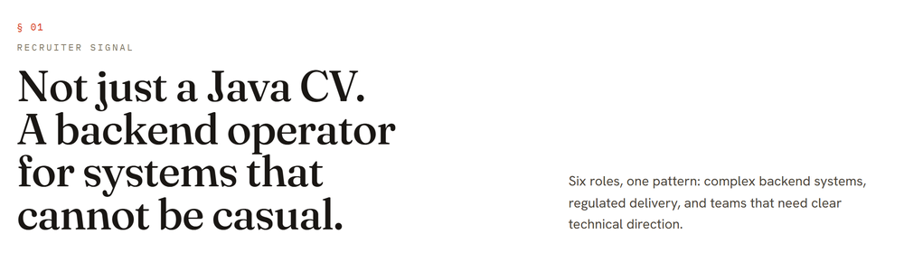
I'm fond of how zakaria.lu looks. It's a deliberate aesthetic — a precision engineering-datasheet: bone paper, near-black ink, exactly one vermilion signal colour, and three type voices each doing one job. I wanted every visual I make from now on — product screens, a slide deck, the odd diagram — to carry that same DNA. So I spent a session teaching Claude Design (claude.ai/design) to build with my actual brand, and walked away with a real component library too. Here's how it went.

The brand is a token system, not a logo
The whole look is a handful of CSS custom properties. Get these right and everything downstream inherits the feel — there's no second accent colour to police, no font soup:
--paper:  #ece4d6;   /* bone */
--ink:    #1a1714;
--signal: #d8381a;   /* the one accent */
--display:'Fraunces';       /* headlines — the soul */
--mono:   'IBM Plex Mono';  /* data, labels, captions */
--body: 'Hanken Grotesk'; /* prose */The catch: my site is an app, not a design system
Claude Design builds with components. My site doesn't have a component library — it's one 1,239-line App.tsx over an 1,810-line stylesheet, with buttons, cards, and rails inlined exactly where they're used. There was nothing tidy to hand over.
But those parts are real, shipped code; they were just never factored out. So the honest move wasn't to invent a kit — it was to extract one. I pulled the recurring patterns into a small, buildable package, @zakaria/brand-kit: 25 prop-driven components carrying the site's own markup and CSS, grouped into foundations, identity, typography, actions, display, and a motif.
Two clean outputs, no magic bundler
The build does exactly two things, with tools I trust rather than a do-everything bundler:
- esbuild emits one ESM file with React left external — the runtime the design agent imports.
- tsc emits the
.d.tstree. That matters more than it sounds: the type declarations are the API contract the design agent codes against.
export interface ButtonProps extends ButtonHTMLAttributes<HTMLButtonElement> {
  variant?: 'primary' | 'ghost'
  size?: 'md' | 'sm'
  arrow?: boolean   // the site's signature trailing arrow
}
I deliberately skipped the popular all-in-one bundler and pinned esbuild + tsc instead — fewer moving parts, no gamble on a toolchain-version mismatch, and I control exactly what ships in dist/.
How Claude Design reads it, under the hood
This is the part I found genuinely clever. A design-system project on claude.ai/design isn't a Figma file — it's a small folder of code the platform consumes in a very specific way, and once you see the shape, the whole thing clicks. The upload is the contract:
- The bundle is one IIFE. esbuild rolls every component into a single
_ds_bundle.jsthat hangs each export off a global —window.<Namespace>— behind a first-line header comment the platform parses. When the design agent writes a screen, it's importing my real, compiled components off that global. Nothing is re-implemented; it runs the same code my site does. - Styles travel as one import closure. A root
styles.css@imports the tokens, the webfonts, and the compiled component CSS. Every design the agent produces receives only that transitive closure plus the JS bundle — so anything not reachable fromstyles.csseffectively doesn't exist for the output. That single rule is why tokens and component CSS have to be wired through it, not merely linked from a preview that never reaches a real design. - The
.d.tsis the contract; the prompt doc is the manual. For each component the platform reads the TypeScript declarations as the API the agent must code against, and a generated usage doc as the reference for how to compose it. Get those wrong and the agent misuses the component everywhere — which is exactly why the build derives them from the real source instead of hand-waving them. - Preview cards register themselves. Each component ships an
.htmlcard whose first line is a tiny HTML-comment marker; a self-check scans for it to build the picker a human browses. React for those cards is vendored next to them so they render standalone, outside any app. - A self-check recompiles on open. The upload ends with a one-line sentinel file, written last so it fences the project while everything else lands. Opening the project trips a server-side pass that re-reads every
.d.ts, registers the cards from their markers, regenerates the manifest from the uploaded source, and clears the sentinel. I never hand-write that manifest — the platform rebuilds it from what I shipped.
So there's no proprietary export format to fight: it's compiled components, type declarations, a stylesheet, and preview HTML, arranged so an agent and a human can both reach for the right part. The flip side of that elegance is unforgiving — a component that renders wrong here renders wrong in every design built from it later, which is what makes the verification step non-negotiable.
Verifying all 25 — with the browser already on the machine
A design system is only as trustworthy as its weakest card, so every component gets screenshotted in headless Chrome and graded before anything ships. The tooling wanted a fresh ~200 MB browser download; I already had Chrome installed, so I pointed Playwright straight at it:
# reuse the system Chrome instead of downloading a second one
export DS_CHROMIUM_PATH=".../Google/Chrome/Application/chrome.exe"
node package-validate.mjs ./ds-bundle   # => 25/25 previews render cleanly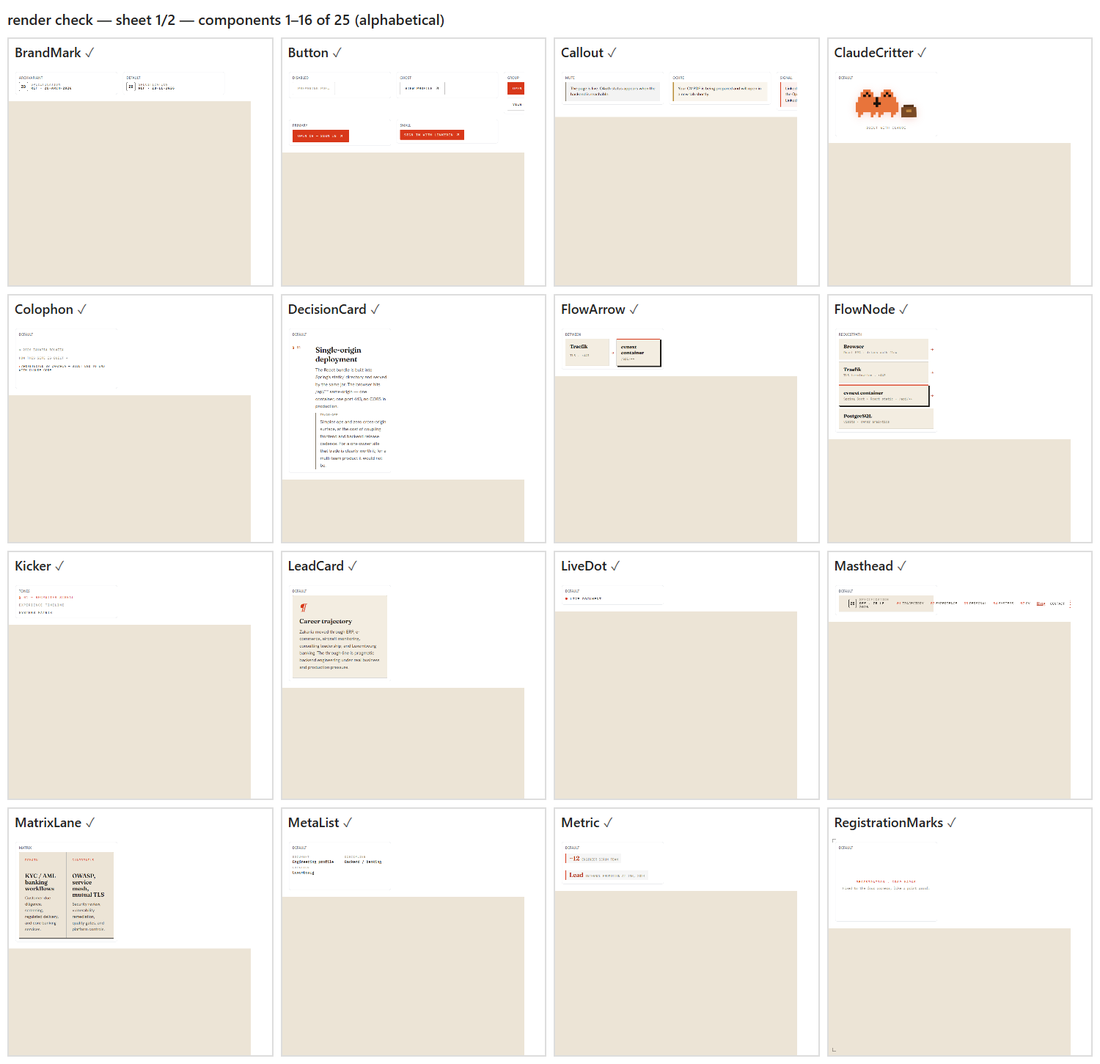
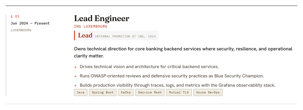
I wrote each preview with real copy from the site — actual roles, the genuine stack, the real architecture decisions — never foo or bar. Those previews are what a human browses in the picker and what the agent imitates later, so placeholder text would quietly poison everything built on top.
A few honest deviations
Faithful doesn't mean photocopied. The live site lays a fixed, full-viewport grain texture over everything through a ::before overlay — lovely on a fixed page, but hostile inside arbitrary layouts, where it can paint over content. In the kit I baked the same noise into the page background with a multiply blend, so the texture sits behind content and composes safely. The masthead lost its position: fixed for the same reason. Small calls — written down in the repo so a future me knows they were on purpose, not bugs.
What I actually walked away with
Two things. First, a design system on claude.ai/design: prompt the agent for a screen, a landing page, or a slide layout, and it now assembles them from my real parts in the right palette and type — and the result maps one-to-one onto code I can ship. Second, a genuine npm package, @zakaria/brand-kit, that any future product can install for a single source of truth.
One honest boundary, because I went in wanting "every visual": this makes the design tool produce on-brand work. It doesn't reach into an existing .pptx or a video file and repaint it. The way to get those on-brand is to regenerate them through the same engine — which, now that the engine knows my brand, is the easy part.
Start to finish — extraction, build, 25 verified components, and the upload — was one focused session with Claude Code. The brand stopped being a thing only my website had, and became a thing I can hand to a tool.