Two Initials, a Shared Identity: Bringing the ZB Monogram to My Website
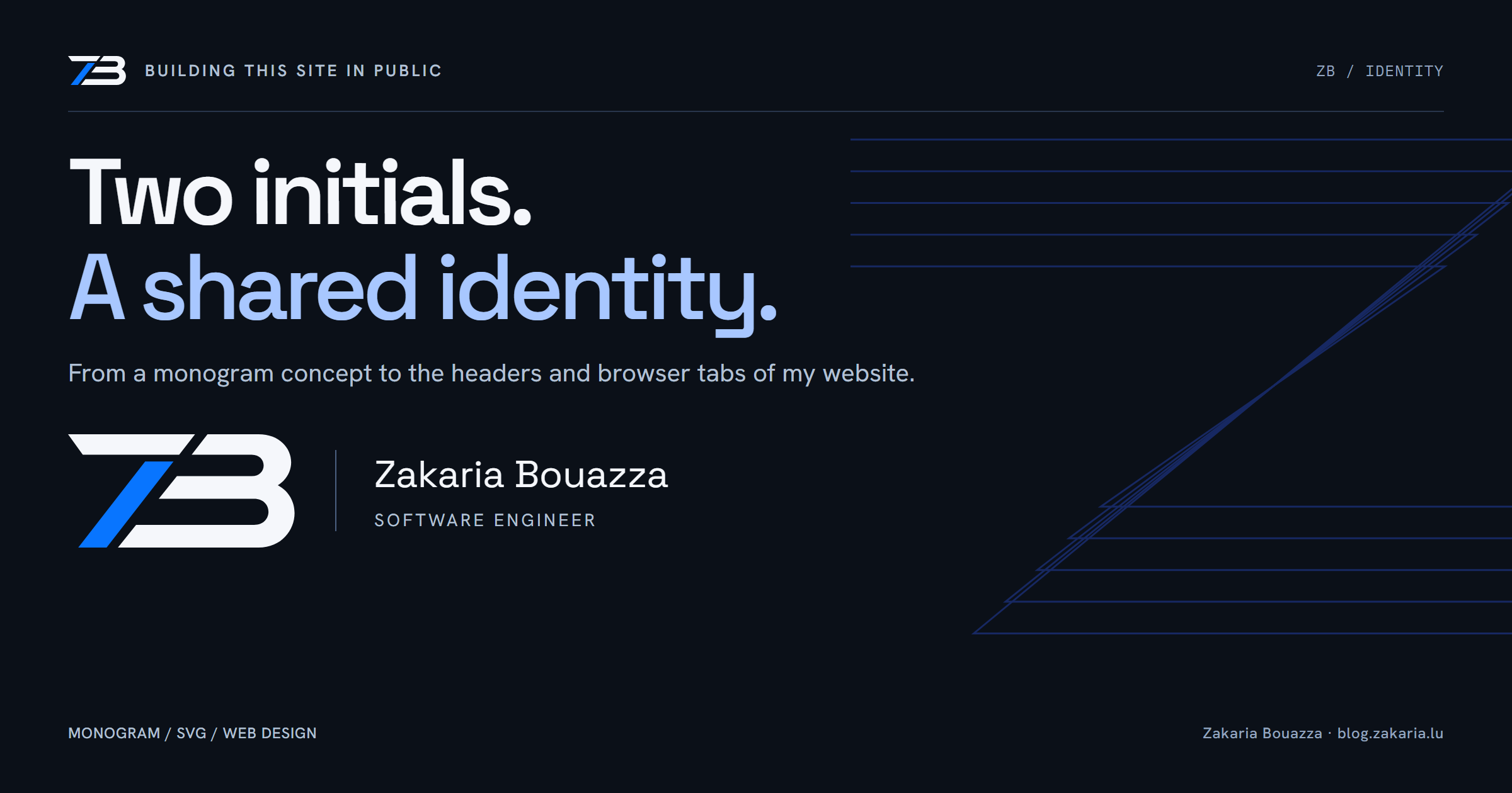
I started with a sheet of logo concepts: my initials, ZB, drawn as a connected symbol, in light, dark, horizontal and metallic treatments. My question to Codex was simple: what do you think?
The useful part of that conversation was choosing where the design would actually live. A logo on a presentation sheet has plenty of space. A website header has navigation, a sign-in link, a narrow mobile layout and a job to do.
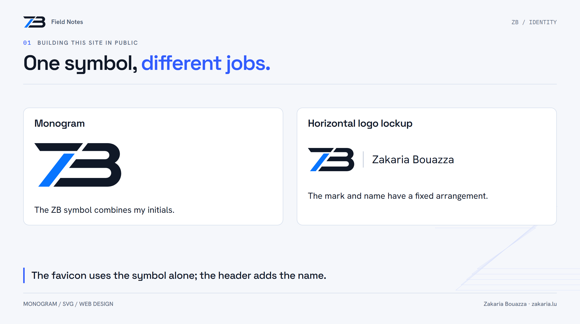
We chose the flat horizontal version for the main signature, the white-and-blue version for dark backgrounds, and the symbol alone for the favicon. Then we put it into the website.
First, I learned what to call it
After shipping the change, I asked whether this was a logo or an icon. The more precise term for the ZB symbol is a monogram: a mark made from my initials. The complete arrangement of symbol, divider, name and subtitle is a logo lockup. My name in its chosen typography is the wordmark. The small asset in a browser tab is the favicon.
Those distinctions helped me describe the implementation. I did not need the full name and subtitle in every place. The header could carry a signature; the browser tab needed a compact symbol.
Why I chose the flat version
The concept sheet included a metallic version with highlights and a blue glow. I preferred the simpler treatment for this site. The portfolio already uses a dark navy background, cool white text and blue accents. The flat mark fits that setting without asking the rest of the page to compete with it.
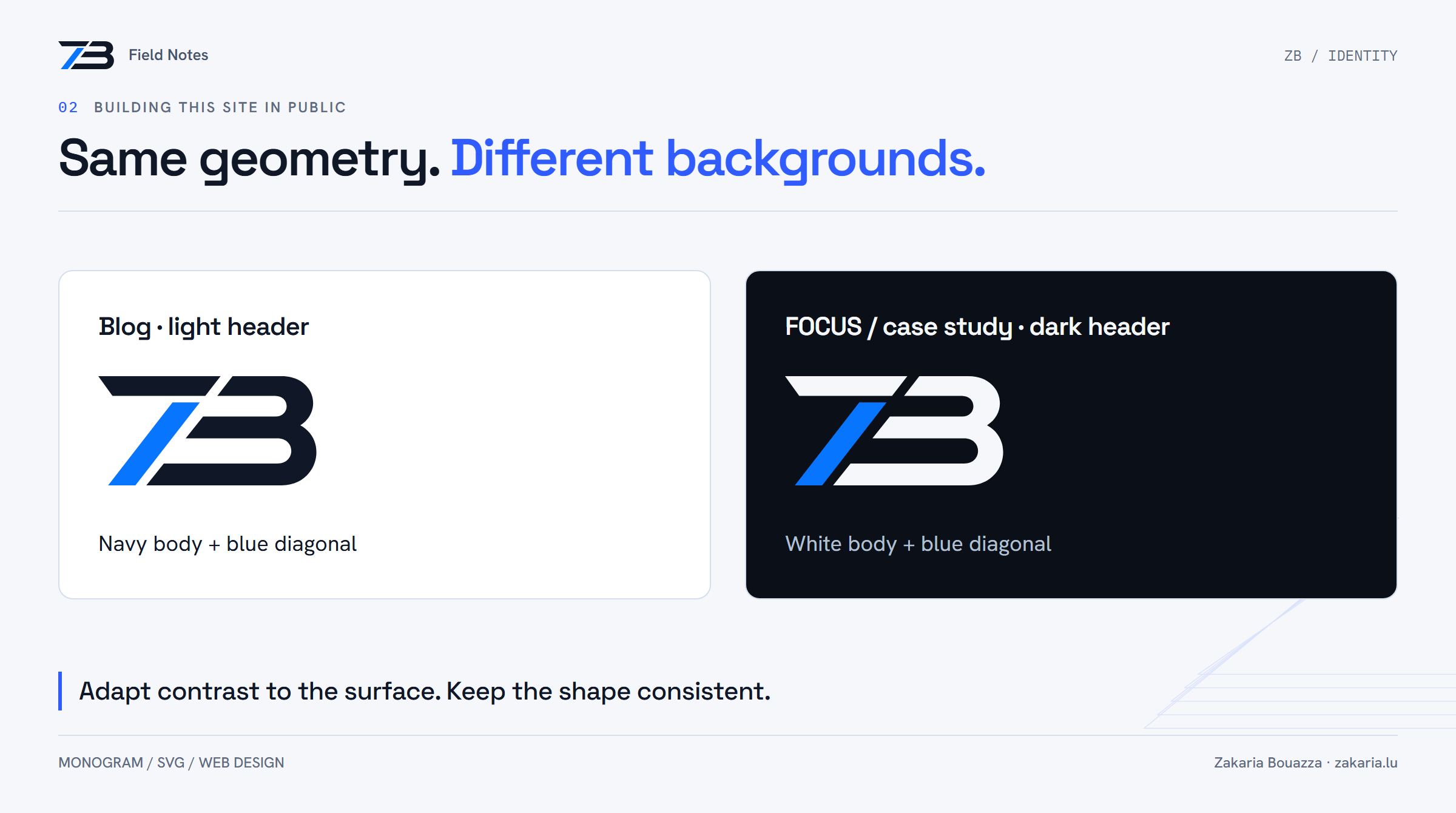
The blue diagonal gives the symbol a focal point. The rest of the shape becomes navy on a light surface or white on a dark one. I kept the website's existing typefaces and shared palette tokens; this was an identity update inside the design I already had.
There is still a design trade-off: the stylized Z can read as a 7 at first glance. We noticed that in the original discussion. The shipped version keeps the abstraction, so I would not claim that letter recognition is solved. It is a choice I can revisit after living with the mark.
Rebuilding the mark for the web
The implementation uses SVG geometry reconstructed from the approved direction, rather than a cropped image of the concept sheet. The mark has a viewBox="0 0 200 100", giving it a two-to-one canvas. One filled path draws the main body; a second draws the blue diagonal.
The body uses currentColor, so its surrounding component determines the foreground colour. The diagonal keeps its own blue fill, #0875ff. That is a logo-specific colour, separate from the site's existing electric-blue interface token.
In the portfolio header, the symbol sits beside my name with a subtle vertical divider and the subtitle “Software engineer.” The responsive layout reduces the mark and hides the surname at smaller widths. The SVG is decorative to assistive technology; the enclosing home link already supplies the accessible name.
One website, several places to update
The first pass updated the portfolio's shared React component. That also changed the footer and the “Ask Zakaria” symbol. But when I asked whether the remaining subdomains were covered, the answer was only partly.
The favicon was shared. The visible headers were not. The blog and public case-study page use server-rendered templates, while FOCUS uses a separate reusable brand-kit component. Updating the portfolio component could not update those copies automatically.
- Portfolio: the horizontal signature, plus the shared symbol in other components.
- Blog: a navy-and-blue mark beside “Field Notes.”
- FOCUS and case study: a white-and-blue mark on their dark headers.
- BuildCV: the shared favicon, while keeping its own product wordmark.
The separate Keycloak sign-in application was outside this branding change. That boundary matters: sharing a domain family does not mean sharing the same frontend assets.
A small visual change still needs a release
I checked the portfolio on desktop and mobile, then the blog and case-study header previews and the FOCUS frontend. The local backend was not running during those previews, so they were visual checks, not a complete authenticated walkthrough.
The frontend and brand-kit builds passed, as did the brand-kit TypeScript check and the shared brand checks. All five PR checks eventually passed. The change shipped through PR #324, and we opened the deployed portfolio, blog, case study and FOCUS lock screen to verify the real result. The new favicon was also checked on all four application hosts.
I like that this change ended with the actual pages. A successful build tells me the code can be packaged. Seeing the header on the deployed page tells me whether the identity arrived where I intended.
A signature that belongs to the site
The result is a small, consistent signature across several different interfaces. The blog still looks like a publication. FOCUS still looks like a workspace. BuildCV keeps its product name. The shared mark connects those surfaces without making every header identical.
That was the useful lesson for me: choosing the symbol was only the beginning. The rest was finding its existing copies, adapting contrast and proportions, and checking that the deployed pages actually used it.