Systems in Motion: a visual identity of my own
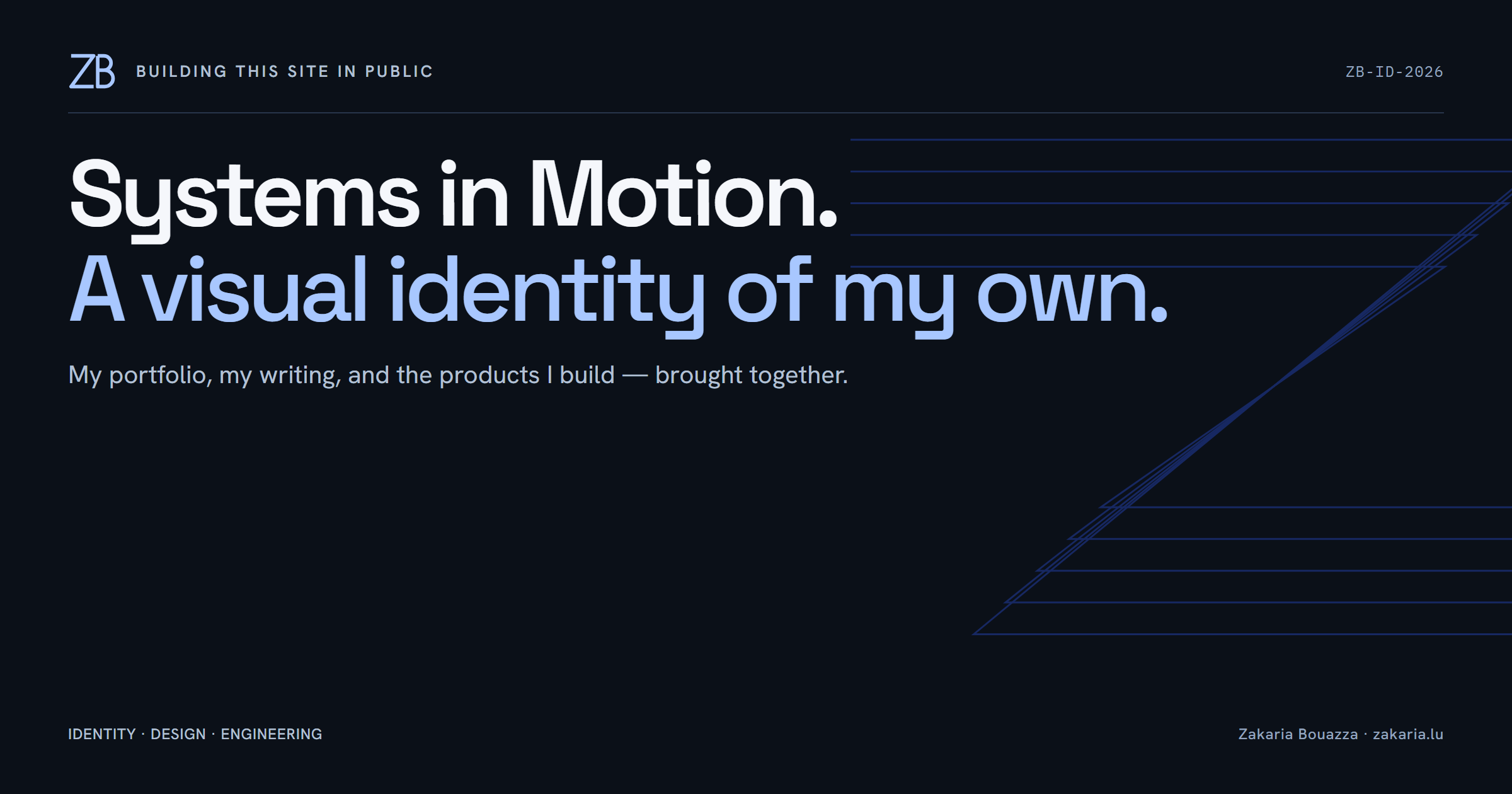
My website had started to look too much like the tools I used to build it. Parchment backgrounds, orange accents, document labels, and vendor mascots made the association hard to miss. I wanted the next version to lead with my own name and the work behind it.
The result is Systems in Motion: a shared visual identity for my portfolio, case study, blog, BuildCV, FOCUS, and emails. It brings my engineering career and independent products into the same picture. The detail I like most is the large Z made from parallel paths, with a pulse travelling through it.
Start with the person and the work
The homepage now opens with my portrait and a direct statement:
I build systems people rely on.
I’m Zakaria Bouazza, a lead engineer in Luxembourg building secure backend systems and independent products. That introduction connects the banking, security, and technical leadership in my career with the things I build outside it.
Visitors can immediately explore my work or get my CV, with the sign-in requirement explained beside the action. Selected work comes next, with product previews for CV Next and BuildCV. A compact career timeline, writing and experiments, and a more personal introduction follow. The portrait stays natural and recognisable, with a crop and fade into the dark background.
This gave the homepage a clearer order. The stack is still there where it explains the work, but it no longer needs to introduce me several times.
The Z is the part I keep coming back to
The small ZB monogram gives the identity a signature. At a larger scale, five parallel paths bend through a Z. A short ice-blue pulse follows one of those paths when the homepage arrives.
I work with event-driven systems, so a signal travelling along a defined route feels appropriate. The connection is specific enough to belong here without turning the homepage into an architecture diagram. I also like the shape when it is completely still.
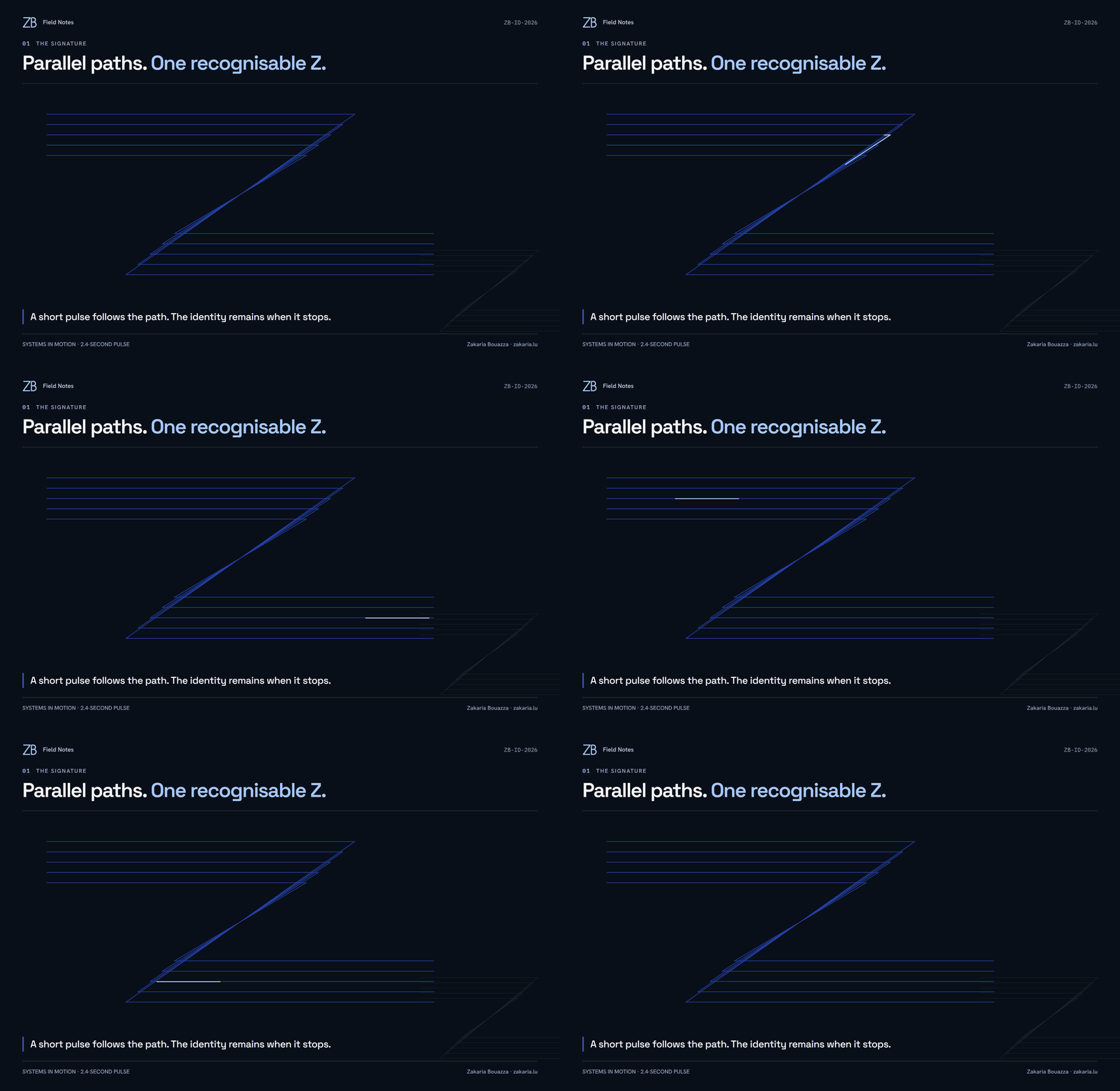

The implementation is small: SVG paths, a dashed stroke, and a CSS animation. On the homepage, the pulse runs once over 2.4 seconds and fades away. Scrolling remains normal. The reduced-motion stylesheet removes the pulse and entrance animations, leaving the static composition intact.
Graphite for the introduction, light surfaces for the work
The palette centres on graphite #0B1018, cool white #F5F7FB, electric blue #315CFD, and restrained ice-blue highlights. Space Grotesk gives headings their shape; Hanken Grotesk carries the body text. IBM Plex Mono is reserved for code and technical annotations.
Those choices do different jobs across the site. The portfolio and case-study introduction use dark backgrounds to frame photography and large illustrations. The blog uses a light publication layout with comfortable article typography. BuildCV has graphite navigation around light forms and a white document preview. FOCUS has a dark application header above a light workspace, including a matching locked screen.
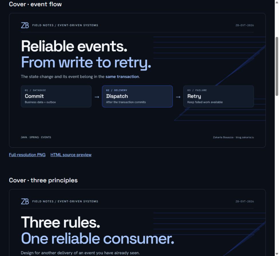
The distinction matters most in the tools. BuildCV’s interface can share my branding while the CV itself keeps its own template typography, page geometry, and print output. A white document should still look like a document when it leaves the application.
The writing needs to belong to the same site
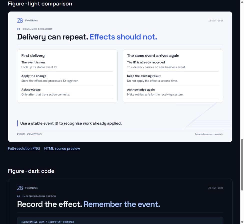
A redesigned homepage would only solve part of the problem if every new article brought back the old covers. I migrated my personal blog-article skill from Claude to Codex at user scope, then adapted its reusable HTML cover and figure templates to this identity.
The workflow still produces an article draft with a cover and supporting figures. The templates now use the same type, colours, ZB mark, and parallel paths as the site. They can travel with me between repositories.
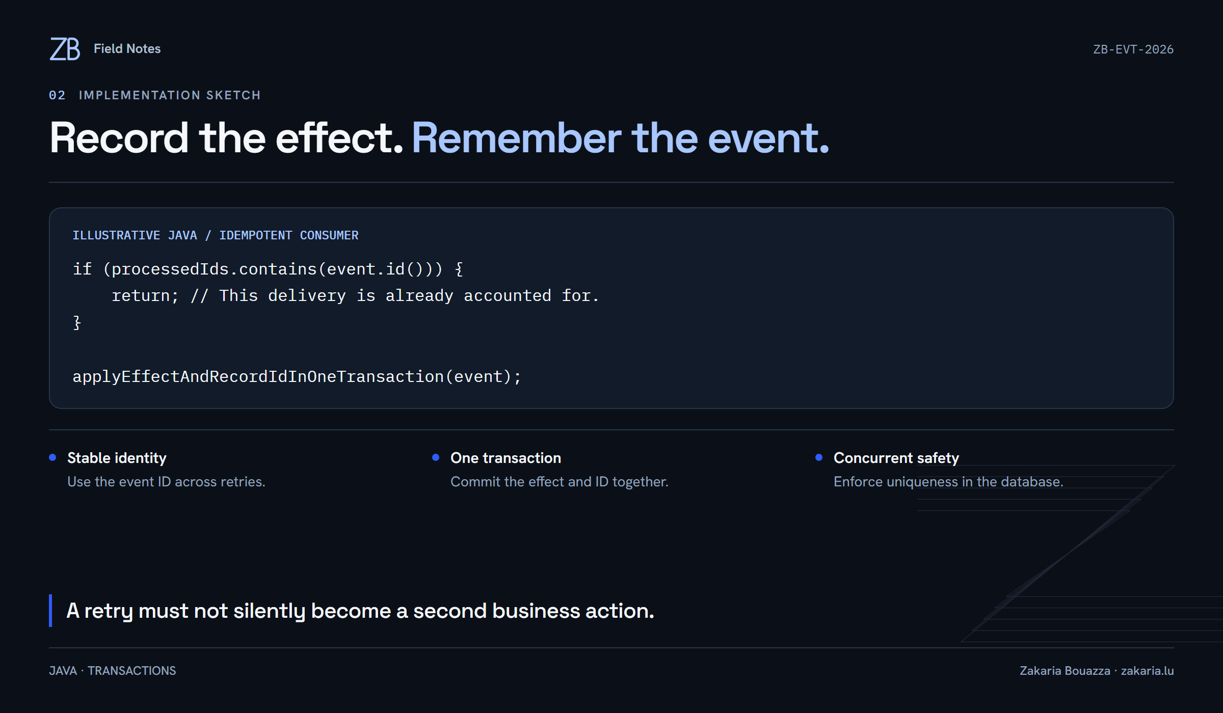
Moving tools does not change the history of the project. Older articles and factual build credits remain as they were. The current presentation now puts my identity first.
A visual release still has engineering constraints
The palette is duplicated across five web stylesheets, including the case study. The emails carry inline colour values separately. I updated all of them and added a consistency check for token parity, text contrast, email colours, and the existing homepage anchors.
The redesign kept the application boundaries intact: no new public APIs, database migrations, authentication changes, or CV storage changes. The blog remains server-rendered, with existing article URLs and pagination preserved. Homepage section links and engagement tracking remain usable. Favicons, browser theme colours, and social preview artwork now carry the new identity.
That is the SEO side of a redesign I care about: keep the site crawlable and existing links useful while changing what visitors see. A new masthead should not make an old article harder to find.
Validation covered desktop, tablet, and mobile layouts, keyboard interactions, and loading, empty, locked, and error states. The release passed 124 frontend tests and 225 backend tests. BuildCV’s print harness produced 40 PDFs across templates, languages, paper sizes, and content lengths. Reduced motion was checked in the CSS; it was not exercised through an operating-system preference toggle.
What I want the site to say
I wanted a site where my engineering experience, products, and writing clearly belong to the same person. The portrait, typography, and selected work do most of that job. The moving Z is the detail that makes me smile.
You can explore the result at zakaria.lu and follow the decisions behind it in Building this site in public.